Eye Of The Temple Review: A Triumphant Room-Scale Adventure


Eye of the Temple brings true room-scale platforming to life with clever game design and engaging puzzles, wrapped in an Indiana Jones-like adventure. Read on for our full Eye of the Temple review for Quest and PC VR.
Over a year and a half on from its initial PC VR release, Eye of the Temple is now available on Meta Quest 2 and Quest Pro. While the initial release was solo developed by Rune Skovbo Johansen over five years, he’s teamed up with Salmi Games for the Quest port. Previous comments from the team indicate that bringing the game to a standalone platform was a challenging feat. Luckily for them, the end result is well worth it.
Room-Scale Platforming
Eye of the Temple is a true room-scale VR platformer. This means that almost all movement you make will be real, physical movement around your play space. Because of that, you’ll need a decent amount of room to work with – Eye of the Temple requires a play space 2m wide by 2m long.
While that’s bigger than you might need for other experiences, it’s not exactly a huge area of total space. It’s what Eye of the Temple’s mechanics do within this limited space – and the clever game design trickery behind them – that makes the release so compelling.
The premise of the game is simple – you start at the beginning of an Indiana Jones-style adventure, standing outside a large temple with a whip in your right hand and a torch in the other. The objective is to complete puzzles or platforming obstacle courses scattered across the various areas in and around the temple. Clearing an area will usually result in the activation of one of several beacons, which will eventually pave the wave for you to enter the temple for the final confrontation with the game’s big baddie, ‘The Darkness’.
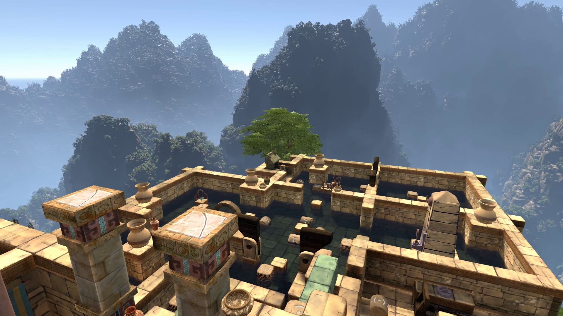
The map exists entirely on a grid of square blocks, which you can hop between to move around. Some blocks are stationary, while others move back and forth between two spots on a set loop. The blocks – and really the entire map – are laid out in such a way that you’ll never have to re-centre yourself, never run out of room within your play space and also never be put into a position where you walk into a wall or need to move to a position outside of your guardian.
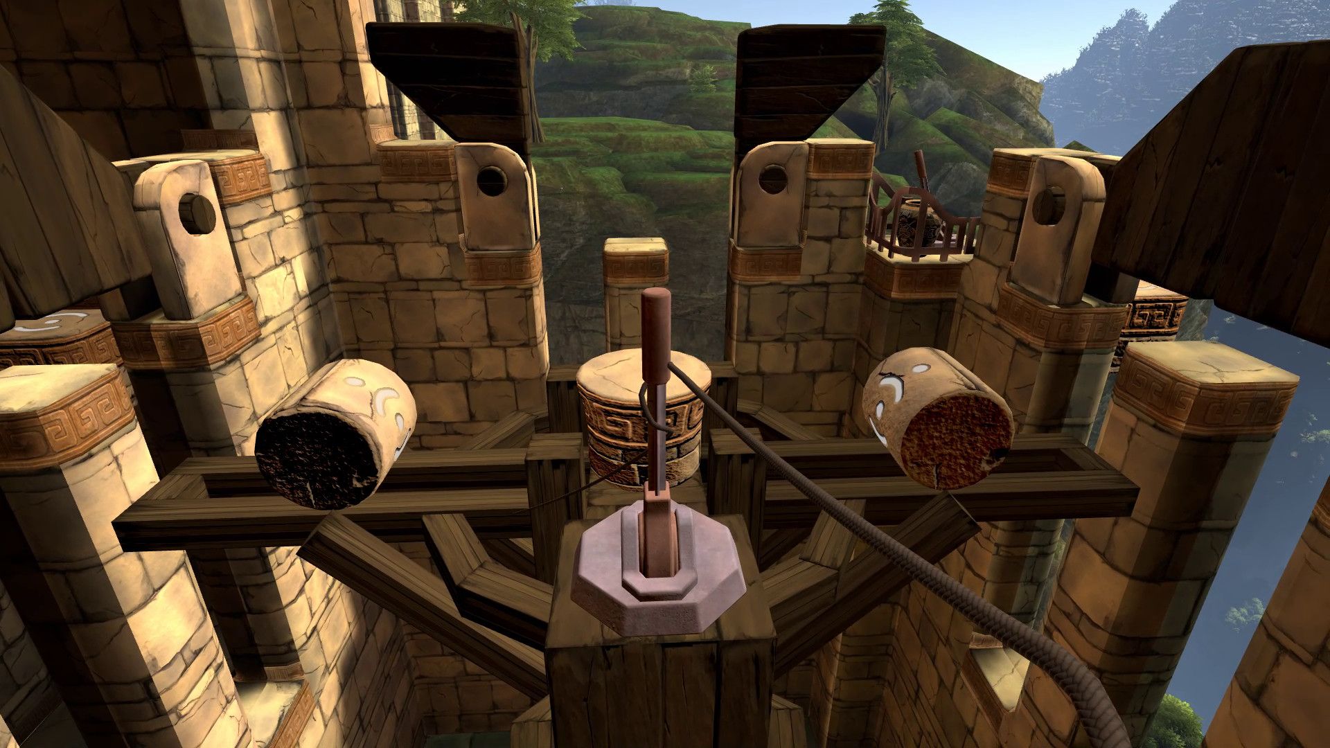
The map is laid out in an arrangement that always works to intelligently redirect the player’s orientation as needed. The works in tandem with the plethora of circular “roller” blocks, which roll between two spots instead of just moving between them. If you stand still on these blocks as they move, you’ll fall off as they roll out from under you. To stay on the roller as it moves, you’ll need to walk backwards – just as you would if you were balancing on one in real life.
This roller mechanic is used to essentially move the player away from the guardian boundary, creating more space by forcing them to move backwards without even realizing it.
This is the kind of ingenious VR-first design that propagates itself across the entire Eye of the Temple campaign. There’s no need for the player to worry about any of the usual hassles that come with a VR play space – as long as you have 2x2m of space, the game will take care of the rest. It’s a rare approach, but one that makes the experience incredibly rewarding and infinitely more comfortable. This also makes it a good option to demo to VR newcomers, especially given the lack of artificial movement.
Mixing It Up
Across the main campaign, the simple room-scale platforming concept gets developed into increasingly challenging scenarios that have additional items and elements to consider. At all times, you have to ensure you step on the right block and don’t misstep into thin air – doing so will see you restart the section, which isn’t too painful thanks to generous auto-save. You’ll also perform dodges and ducks in platforming sequences, which then get mixed in with combat, puzzles and timed challenges.
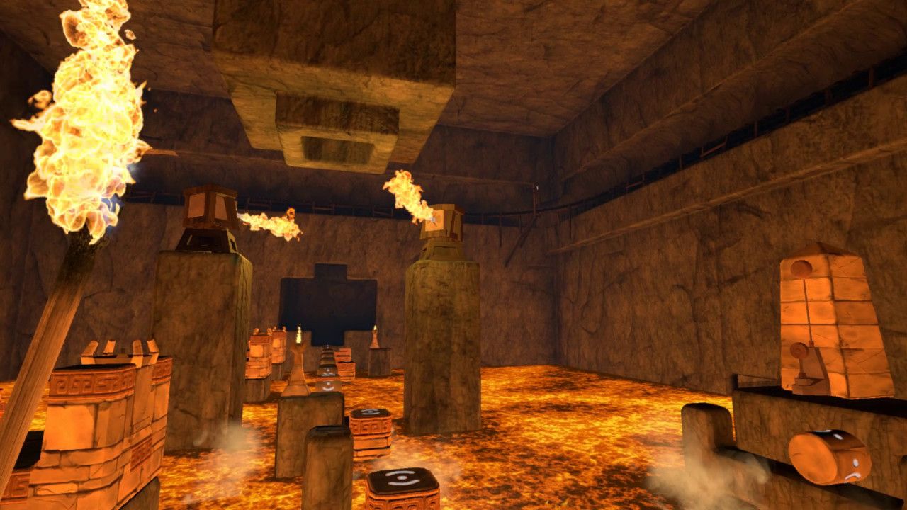
Your two tools – the whip and the torch – are the main way the game adds complexity. The torch can be lit by fires placed sporadically around the map, which you can then use as a light through dark indoor passages or to light beacons that open doors or trigger other effects. The whip in your right hand is used to smash items, pull levers and in basic combat against some pesky-but-infrequent scarab enemies. It’s not always available – it unfurls itself automatically on relevant blocks – but it’s a joy to use with enough depth to ensure your technique will improve as you play.
All of these elements are combined with the room-scale platforming to create an intriguing and varied campaign that doesn’t outstay its welcome. Once you get comfortable with the basic mechanics, the temple’s various areas begin to open up into more of a non-linear structure. You can complete later sections of the temple in any order you like, or even skip some areas to head straight to the final boss, at the expense of extra challenge. For most players, the main campaign will probably fall somewhere between three and five hours. There’s also a speedrunning mode for those who want replayability, currently available for three areas of the map or the entire game, with more individual areas to come.
Exploring the Environment
There’s an absolute joy in the exploration of Eye of the Temple’s environments. Because the moving blocks are constantly working to a set beat, you settle into a comfortable pace as you explore the surrounds. The puzzles are set at the perfect level of difficulty – enough to ensure you have to stop, think and plan ahead, but never tedious to the point of frustration.
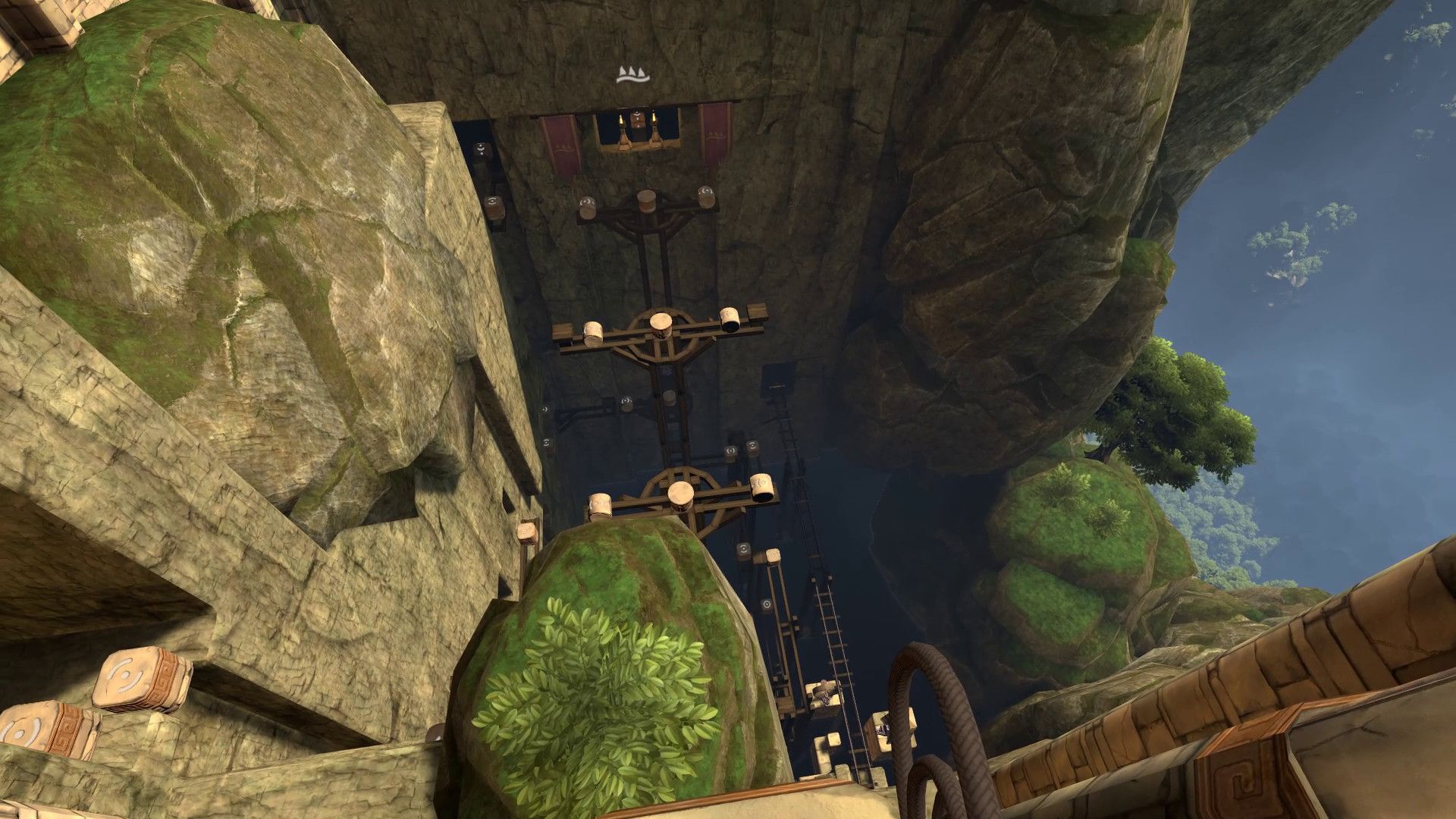
The visual design of the environments also convey key points intuitively, requiring little hand-holding or direct instruction. Often you can simply look and observe the area to find the best (or only) way forward. There’s also some nice touches that make the design feel polished, such as the blue bird that flies around the map and acts as your initial directional guide as you get settled.
Each moving block also generates a floating string of rubies that appear while you’re standing on it, which you can collect with your torch or whip while moving from point A to B. The rubies also act as digital breadcrumbs – once picked up, they won’t respawn, making it easy to tell when you’ve already cleared an area.
These rubies are also essential for progression, as they’re exchanged to activate the various beacons spread across the map. Once activated, the beacons emit a spiral of light that shoots up through the sky to the final section of the map, visible from almost anywhere. It’s an intuitive way to build tension while also demonstrating the final end point of the map to the player.
Performance & Visuals
Playing on Quest Pro, Eye of the Temple ran without a hitch. While it may have been a technical challenge to get the game running on standalone hardware, it’s ultimately a super smooth experience on Quest.
That said, some compromises clearly had to be made in the visuals department. For the most part, it’s not an issue and the adventurous style of the original release is represented well on standalone hardware. Visually, it’s about on par with any other Quest port out there.
That said, the picky will notice a few things. The implementation of fixed foveated rendering, for one, is very obvious. Near the top of your field of view, there’s a distinct horizontal line where the visuals switch to a resolution that’s much lower and much more jaggy. It’s mostly unnoticeable, but still present. Likewise, a few textures have been clearly downgraded in resolution, but it’s rarely drastic.
It’s worth noting that despite these compromises, there’s an impressive breadth and scale to some of the environments in Eye of the Temple that make it an impressive release on Quest. Combined with other complicated elements like water visuals and rope physics, you can begin to understand why the port proved such a challenge.
Eye of the Temple Review – Comfort
Eye of the Temple focuses on room-scale gameplay with physical movement around your real environment, which means it should pose a relatively low risk of nausea for most players.
However, the game warns some players “may get a sensation of almost losing your balance when blocks you stand on start or stop moving.” Likewise, I found there can also be some disorientation when walking backwards on the rollers, as it combines backward physical movement with forward in-game movement.
The game also includes safety warnings that instruct the player not to jump between blocks or walk off blocks into thin air, which can result in injury.
Later sections of the campaign also include access to a minecart that moves along tracks to transport the player around the temple. While this saves time, these short sections of artificial movement could be uncomfortable for those prone to nausea. Vignetting is automatically applied during turns, but not during straight movement.
Eye of the Temple Review – Final Verdict
Eye of the Temple is a masterclass in VR-first design. It takes the responsibility of managing a guardian away from the player and ingeniously absolves the problem by weaving it into the very fabric of the game’s mechanics.
The result is a seemingly endless play space, achieved through subtle but very clever design tricks. However, the behind the scenes trickery will likely go unnoticed by many – as it should. It’s invisible design done well.
Eye of the Temple is an essential VR experience, featuring a well-paced campaign with interesting mechanics. It’s a release that demonstrates how intelligent design can work within the constraints of current technology, while ultimately sacrificing very little to do so.

UploadVR focuses on a label system for reviews, rather than a numeric score. Our reviews fall into one of four categories: Essential, Recommended, Avoid and reviews that we leave unlabeled. You can read more about our review guidelines here.


